By John McKown
President of EvoGov, Inc.
In this article, I will share with you the approach and strategy that we used recently to improve the logo and brand message for a water and sewer district.
The Starting Point:
The customer has an existing logo that was designed in-house by a staff member.
It was comprised of a green circle with the acronym of the authority surrounding drawings of; a sailboat, a water tower, and a glass of water.
The logo also included the date that the authority was established at the bottom of the logo.
The goal of this existing logo was to represent the different ways in which water is provided and enjoyed by customers, with the green representing the environmental aspect of their services.
I will break down the issues with this logo throughout this article as I show you how we approached the redesign.
![]()
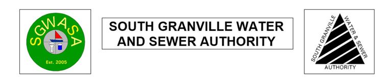
The water authority also had an alternate logo, and both logos were used in the header image of the website.
The secondary logo was comprised of a triangle shape with heavy diagonal black lines. The name of the authority wraps around the triangle.
![]()
One of the unfortunate aspects of this secondary logo is that warning signs for hazardous materials are typically triangular or diamond in shape.
The fact that this secondary logo looks like a hazardous material sign is unfortunate because it doesn't represent the image that a water authority would want to present to the public. When you think about clean drinking water, you don't want to see a hazardous materials sign.
Hazardous materials decal that you can purchase online:
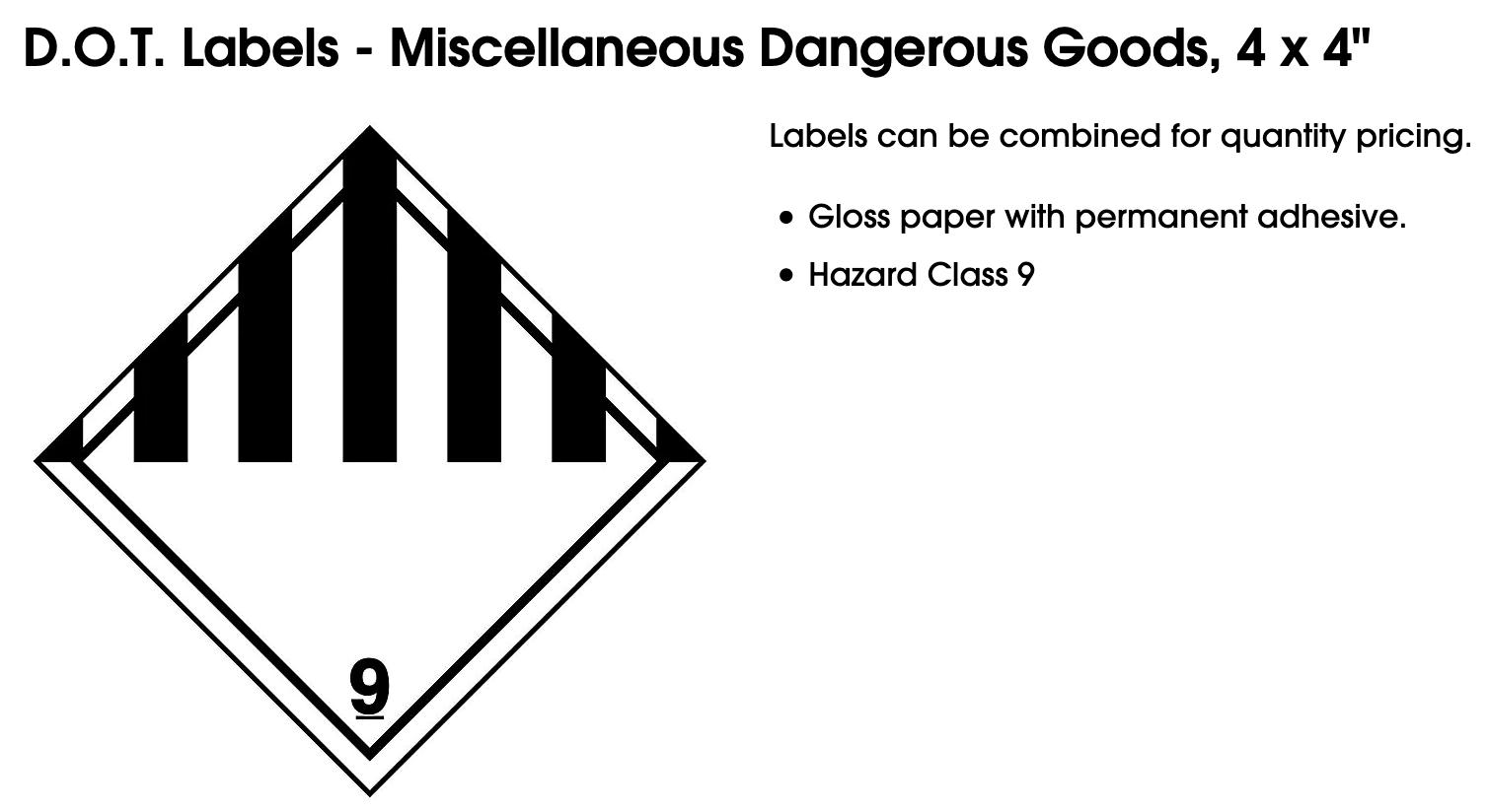
Source: Uline product decal for hazardous materials
The header of the website before the redesign used both logos, with the name of the water authority in the center.
Trying to incorporate the entire name into a brand identity or logo can sometimes be difficult.
Special districts sometimes have very long names, tag lines and slogans, so this can present a design challenge.
Try to keep in mind that there is no hard and fast rule that states that your logo needs to contain your organization's name spelled-out.
Displaying two separate logos in the header creates brand identity confusion for the public, as well as for the staff at the water authority because they don't know which logo to use.
Since neither logo was fully adopted over the other, this also gives the impression of indecisiveness at the agency - which also is not ideal.
The Logo Redesign
Goals
We felt that the new logo should be more than a shape, color, and a font choice. It should be meaningful, recognizable, and professional.
- To create a new logo that is MEANINGFUL, we felt that it needed to symbolically represent multiple aspects of the authority.
- To create a new logo that is RECOGNIZABLE, we needed to create versions of the logo that would stand on their own for multiple uses. For example, if you want to embroider the new logo. you would need a version of the logo that is comprised of solid, flat shapes so that it can be sewn into a patch, shirt, or hat. Versions for use in print that use CMYK colors is also important. Lastly, a black and white knockout version of the logo may be useful for laser engraving or other uses.
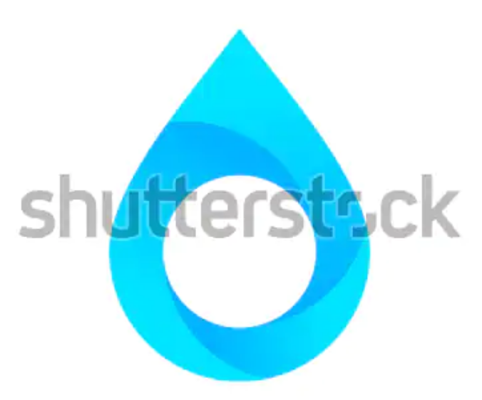
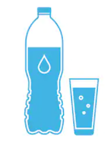
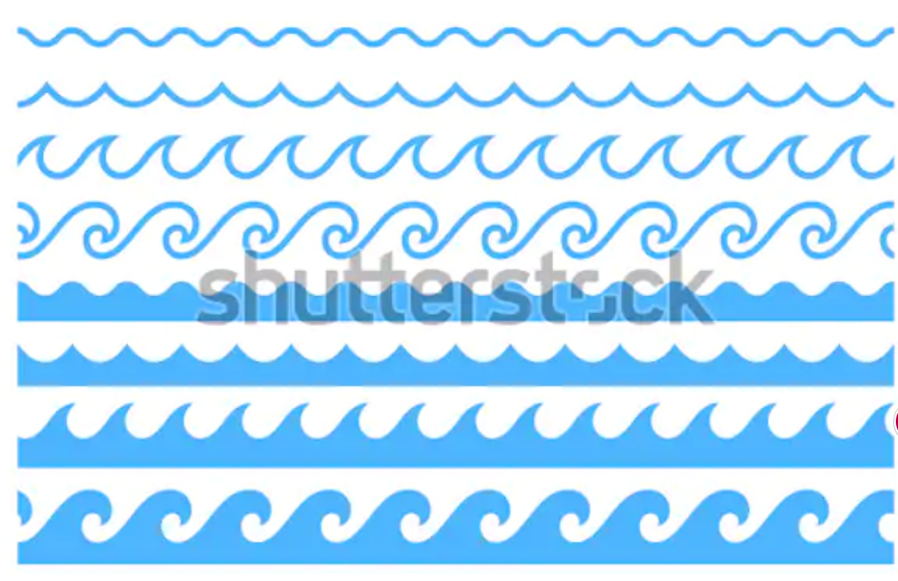
- To make the logo PROFESSIONAL, we felt that we needed to avoid the overused common trappings of; a glass of water, a water droplet, or an ocean wave shape.
Color Choices
When choosing colors for your logo and branding, it is important to NOT use primary colors as your main color choices.
The green, yellow, and black in the older logos above illustrates this perfectly. The green is very electric, and the yellow is as well.
When logos are designed in-house, it is very common for the non-designer to use primary reds, greens, yellows, and blues.
The base primary colors in your computer tend to be overpowering for both on-screen use and also in print.
Looking at the older logo, the green bothers your eyes, but it hard to identify what is causing that irritation at first.
When we were children, we were sometimes given very few color choices.
When the goal is simply "I want to use green and blue for the logo" it is easy to fall into the trap of just "green" and "blue".
Digital design provide us virtually unlimited options for color, hue, tints/shades/lightness, saturation, and even opacity (translucency).
With some basic understanding of color theory, we can expand the design options well beyond the basic primary colors. Using shades and hues will add richness and depth to the new design.
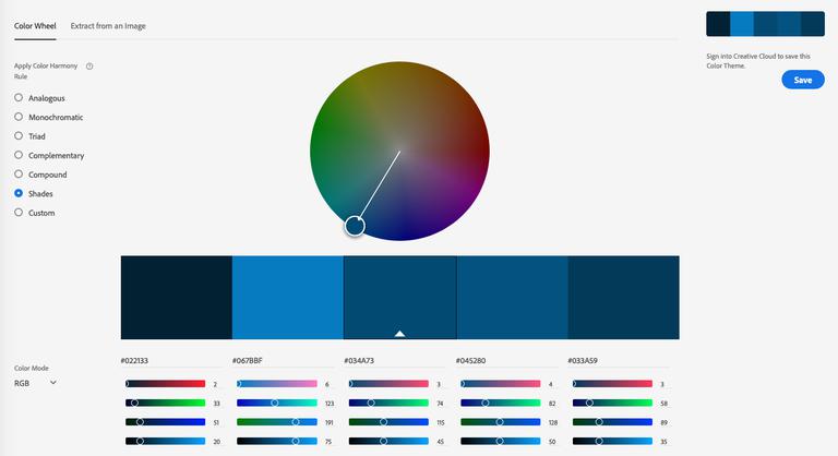
Using Adobe's free online color tool (https://color.adobe.com), we were able to choose a blue that represented the base color of the new logo that we were happy with.
From there, we were also able to generate shades of the base color to create accent colors for the new logo.
Be careful to take notes on the CMYK and RGB color values as you choose colors so that you can reference them later.
Font Choices
Fonts, like colors, are very limited if you are only using the available fonts that come with your computer.
Unfortunately, logos have been designed for decades using the basic computer fonts that come with operating systems, usually with very bland results.
Designers understand that good fonts choices are an essential element of a good design, yet bad font choices seem to be everywhere.
For a humorous take on this, see this classic YouTube video "When good people choose bad fonts" - it illustrates designer frustration with poor font choices perfectly.
Today, the Internet frees us from this limitation of operating system font choices. Font designs are not easily copyright protected, but their names are.
So in many cases, you may find alternatives to expensive fonts online by searching for their alternatives.
Google also offers thousands of free web-based fonts that can be downloaded for use on your desktop at https://fonts.google.com.
You can use the google fonts website to preview fonts as well.
Much like a mechanic that has a very expensive set of tools, designers also invest quite a bit of money in their professional font libraries. While there are many free fonts available for download online, sometimes the best font for a particular project must be purchased. We have collected and purchased thousands of fonts over the years.
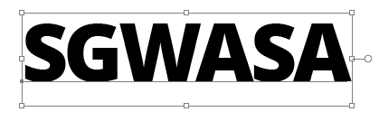
The old logo used an Arial font, which is a very overused operating system font. We settled on an Open Sans Extra Bold as the font for the new logo.
Using a font browsing program, we were able to preview the logo using many different fonts. We were drawn to the shape of the letter "S" with this font.
The font spacing had to be manually adjusted, as is the case with letters like S, W, and A that have curves and angles.
Shapes
Much like the Nike swoosh logo, or the three stripes of the Adidas logo that form a sandal, shapes can add quite a bit of personality to a logo.

When choosing our logo shapes, we want to avoid taking the easiest route - clip art.
With water districts, we have seen way too many water droplets, water bottles, glasses of water, and ocean waves.
These images have their place in the content of the website, but perhaps they are not the best for the brand identity itself.
Below I will show you how the shapes were designed.
The New Logo
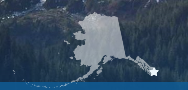
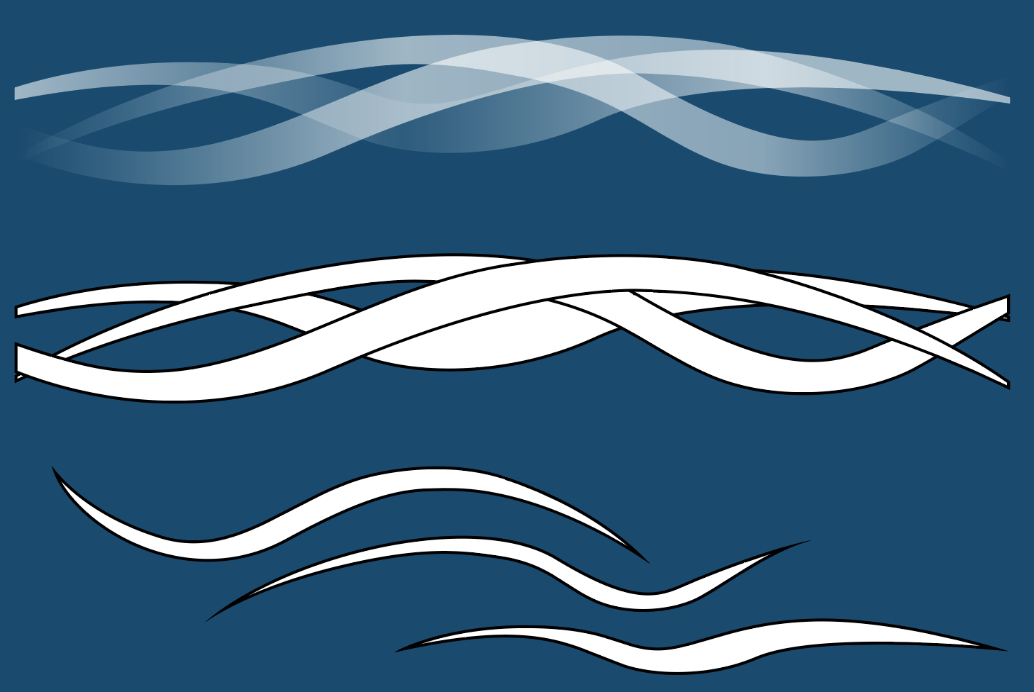
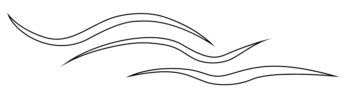
We began with the thought of wave shapes that could be worked into the design of the website. With many of our website designs, we have used used "ghosted shapes" which are shapes, government seals, or logos that may be black, white, or another color that have their translucency lowered so that they are transparent. A good example of a ghosted shape is this of the State of Alaska outline that we placed at the bottom of the Ketchikan Alaska website (see below). We wanted the waves to have a similar effect in the logo, but multiple waves overlapping each other would simply become solid. So the new, original idea was to make the waves translucent, but using transparency as a gradient. This allows the waves to be overlapped to add a lot of depth and style.
Using Adobe Illustrator, we created original designs for the shapes of each wave.

These waves would overlap, be translucent, and complement each other.
For us, the three wave represented the water services, sewer sewer services, and the environment as being intertwined.
Here you can see the progression towards the ghost wave look we were striving for:
We then asked ourselves "could the ghosted waves serve as a separator within the logo itself?"
Could the waves then separate the name from something else? How about a body of water?
It may work, it may not. Let's give it a shot...
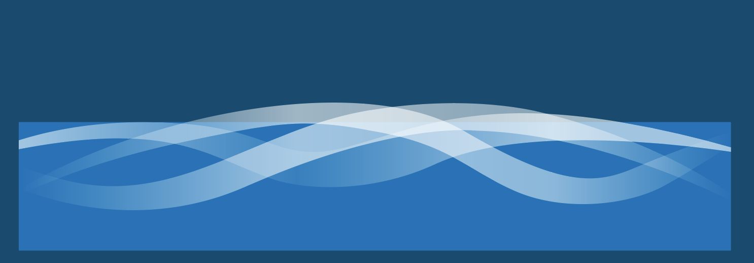
We really liked this outcome so far. And the light blue square represents water as an abundant, but finite resource.
This adds to the overall brand story and meaning of the new logo.
Logo Brand Story and Meaning
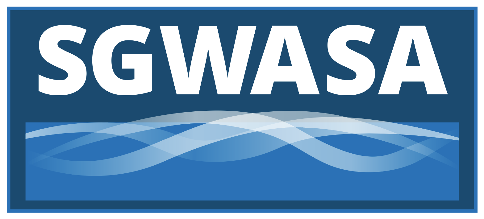
The updated logo was created with multiple elements that each bring their own meaning and significance. Together, they create a bold, recognizable service mark that should stand the test of time.
The Three Waves
The three waves in the logo represent the water services, sewer services, and the environment. They all weave together because they are harmoniously related to each other in life.
The Body of Water
The light blue box represents reserves of fresh water as an abundant, but finite resource. As stewards of available drinking water to communities, this represents the responsibility and commitment to the public to provide reliable and safe water-related services.

The People
The deep blue foundation box that encompasses the logo represents the depth of the people of SGWSGA. People are the foundation of the services provided to the community. Without dedicated, passionate people, there is no SGWSGA.

Courtesy and Service
The light blue outer ring represents the face of the company that customers see. It stands for; courtesy, respect, and desire to serve customers beyond their expectations.

I hope you enjoyed this article and that it helps you with your branding goals.
Contact
EvoGov, Inc.P.O. Box 3614
Parker, CO 80134 USA
info@evogov.com
303-557-0168